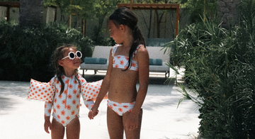


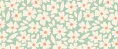


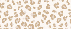


Many parents love soft pastel and neutral colours. They give swimwear a calm appearance and perfectly complement the cute designs of Swim Essentials. But did you know that these colors are less visible underwater compared to bright colors? This can be an issue when it comes to your child's swimming safety.
At Swim Essentials, we think it's important that our swimwear is not only beautiful but also safe. In this blog, we explain how we always ensure that our swimwear for are still visible underwater. This way, you can enjoy a day of swimming with peace of mind!
Why is visibility underwater important?
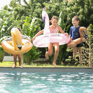
Safety first: Whether you’re swimming in a pool or spending a day at the beach, it’s incredibly important to always be able to see your child clearly. Especially when there are many other children playing in the water, it can be challenging to quickly spot your little one. Visibility is therefore a key element of swimming safety.
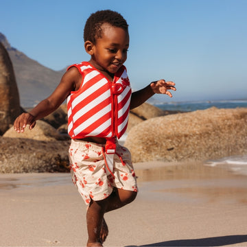
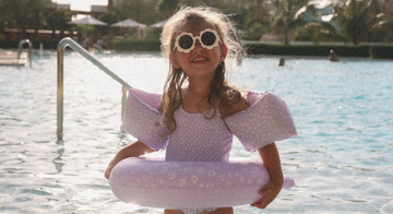
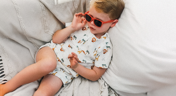
Colors and visibility: The difference in visibility mainly comes from the color of the swimwear. Bright colors, like neon pink or bright orange, stand out well in the water and are therefore easier to spot. Pastel colors and neutral tones, on the other hand, are less noticeable, which can reduce visibility underwater.
How we keep it beautiful but still safe
Why pastel and neutral? At Swim Essentials, we love soft pastel and neutral shades. They radiate calmness and perfectly match the playful and stylish character of our swimwear. Moreover, these colors look beautiful on children and give off a summery, cheerful vibe.
Our solution: Of course, we want these beautiful colors to not compromise safety. That’s why, in every design, we carefully consider visibility underwater. We choose materials that reflect light, add clever details like contrasting accents, and test everything in the water. This way, we always combine the best of both worlds: the beautiful soft colors and the safety that’s so important for your child.
How we ensure pastels are still visible
We consciously do not offer swim safety products in dark blue in our collection. Dark blue can blend in with the water, making it less visible. At Swim Essentials, we prefer colors that are not only beautiful but also stand out.
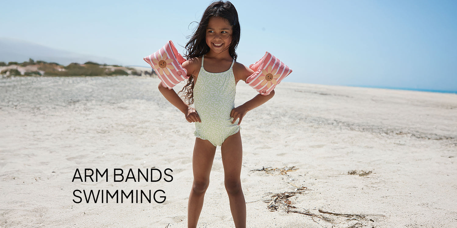
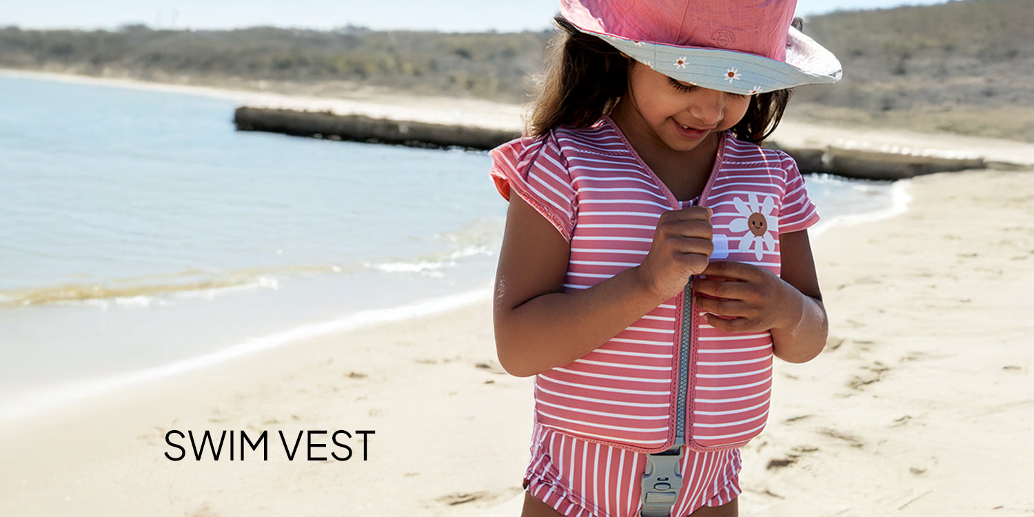
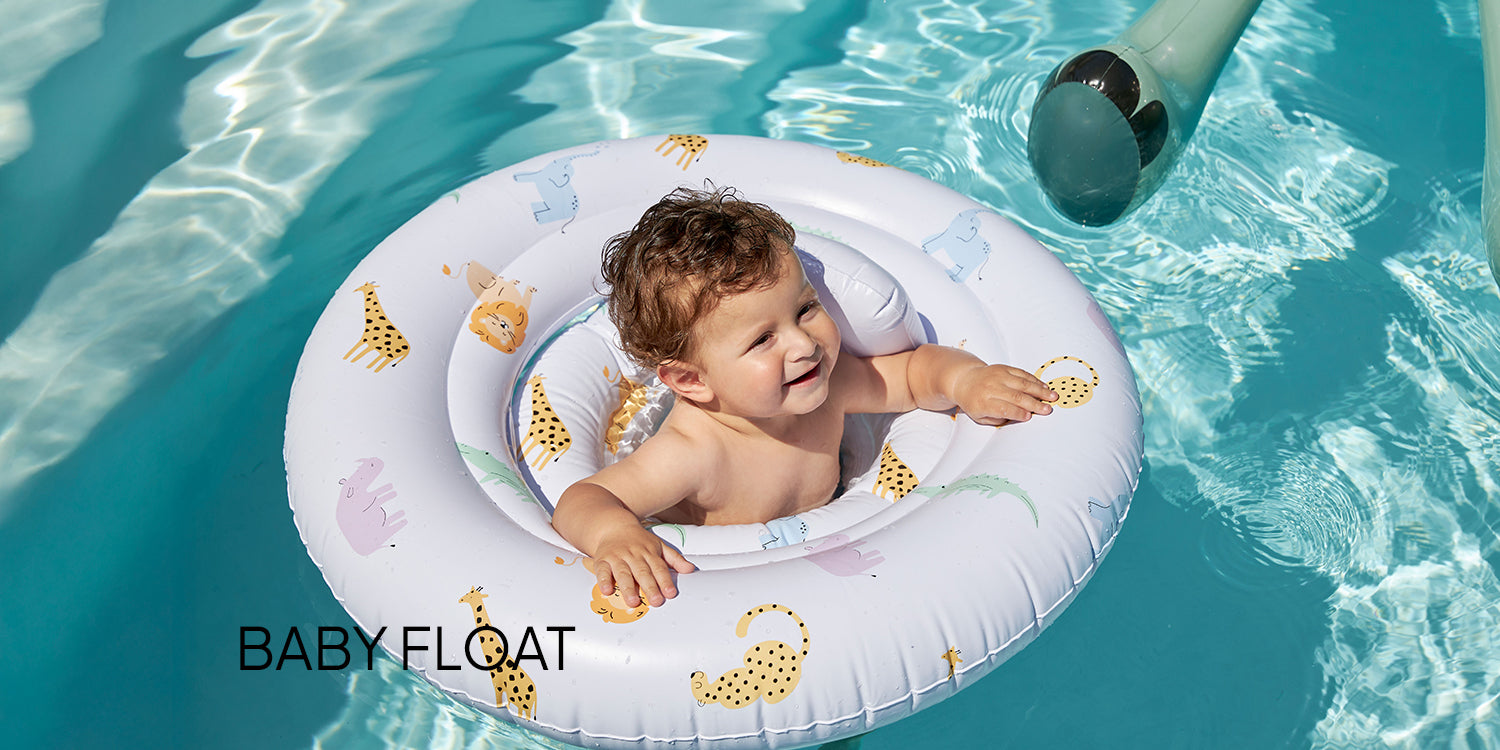
That’s why we use as many warm colors as possible in our designs. These tones give a soft look while still providing enough contrast in the water to remain visible. This way, your child can enjoy stylish swimwear that perfectly matches our look, while still being safe. Want to see what that looks like? Check out one of our products products below!